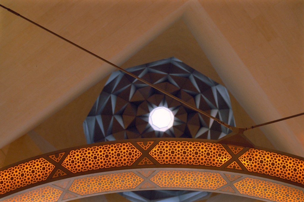
This is one of the successful pictures from my first trip to the Museum of Islamic Arts that opened recently here in Doha. It's not difficult to take a good picture in this building as the architecture is quite stunning. It is simply a matter of finding something interesting and isolating it.
This photo relies on contrasts of sharp and soft, round and straight, warm and cool colours and even intricate detail vs. smooth areas that are almost detail free. The rest of the work in this image just has to do with balancing forms and weights of tone in the frame. This is best judged by eye but as a general rule a shape should be fully present or not. Slivers of half-formed shapes can be distracting.
The best advice generally is think about why something catches your eye and try to isolate it in the frame in an interesting way.
No comments:
Post a Comment