Wednesday, 25 February 2009

Learn To Recognise Why Something Strikes You

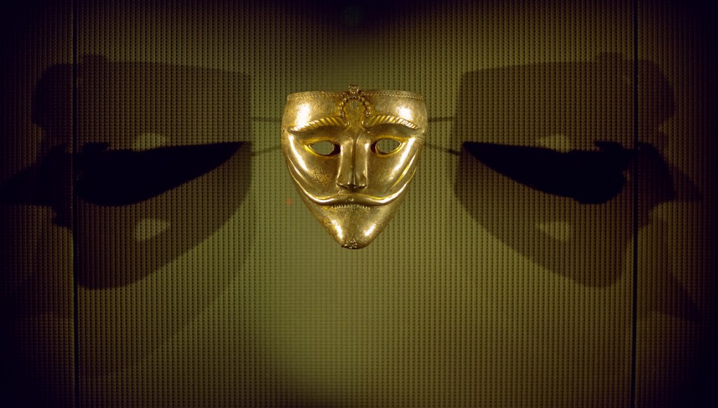
War Mask

If you go to the Museum of Islamic Art in Doha you will see this mask. It is very strikingly presented. One of the great things about the way the Museum have displayed it is that they have lit it in a way that makes very interesting patterns from the light and shadows. I wanted to capture this.

The first thing to recognise was that I was only going to capture the museum's lighting by NOT using a flash. The museum allows no stabilising aids (no tripod or monopod) so there are some things I would need to consider to get the shot I wanted.

I would have to use a higher ISO. I only had ISO 200 film loaded so I couldn't do much about that. The only way to improve the shutter speed any further was to use the largest possible aperture. Here is where having the 50mm f1.4 prime lens fitted was a great help. This still left a rather slow shutter speed so it was a matter of bracing as well as possible and using the most gradual "sniper" release for the shutter. This means easing up on the shutter and not making any sudden moves when it fires. After the shot your finger should still be in the same place.

Once I had decided to take a "natural light" shot I had to decide the framing. The mask, being the focus, should be as large as possible in the frame. However, the picture needed to include all the light and shadow around it that made it so interesting. I moved to frame tightly on the edges of the spotlight lights. This gave me a minimum of wasted space in the frame. Always try to use every milimeter.

Finally, I had to consider the shape of the pattern. It is a symmetrical lighting pattern so I knew that I should avoid shooting the mask at any kind of angle. The only way to have the lighting appear symmetrical was by being directly in front of it. Always strive to get the picture right when taking. This means being as square on as possible for a shot like this. It also means that unless a deliberate tilt is intended for effect the camera should always be dead level.

The final step is afterwards. Once you have your picture scanned don't forget that the image you want has a different shape to the frame on the film. If there are areas above and below that are not part of your intended composition trim them off. Every part of a finished image should work towards that image.

Create Some Drama

Nice Writing

This was a page in a display case at the Doha Museum of Islamic Art. It really caught my eye so I wanted a picture of it. The writing was nice but I didn't want it to be just a page of writing. For this shot I held the flash high and to the side. By holding it to the side I would bring out any texture in the paper and ink. By holding it high and very close I was able to have a cone of light that made some parts brighter than the others. Almost like a light from a torch or a searchlight.

Now it's not just a page. It's a page with very possibly a story.

Three Dimensions In Two

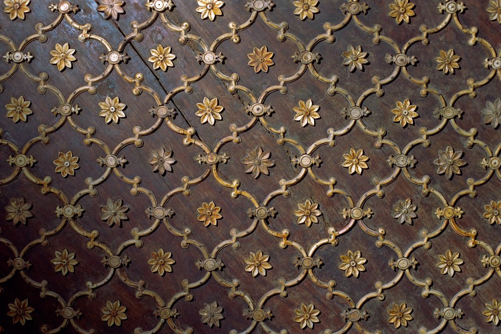
Laticework on Hardwood

One of the hardest things to convey in a photograph is three-dimensionality. One of the classic "photos that didn't work" is when you see a great pattern in a bare tree or bush. You take a picture and it looks like nothing. Why? Because all the spatial clues we get from seeing it in stereo are gone and now all those branches are just on top of each other on a flat picture. To see if there is still something interesting you can try previewing with one eye or just looking critically through the viewfinder.

What about something like the picture above, though. This is a detail of an ornate door with a very impressive raised latice on it. It is in a relatively dark display case so we have the opportunity to modify the light. Actually, you can often modify the light. With a high shutter speed and the flash held close you can often modify the light in broad daylight. But I digress.

For this shot I really wanted to see the relief and texture. I simply attached the flash to the camera with a cord (a so-called TTL cord) and held the flash so the light would rake across from the side. This makes small shadows at every hole and bump and helps our eyes to see the three dimensional shape and the texture.

Thursday, 19 February 2009

Seeing It

MIA and Sky

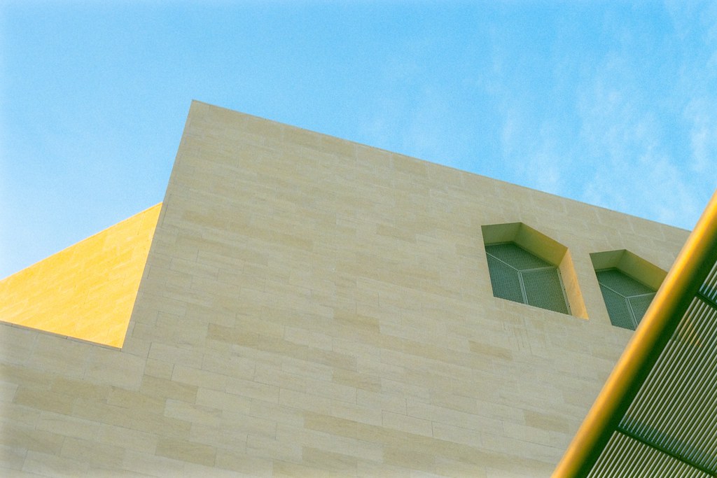
This new museum has a very pleasing shape. It's not hard to get a good picture of it. What is a little harder, though, is getting a decent original view of it.

Composition is a hard skill to learn unless you are one of those people with a natural gift for it. It is easier once you start to learn the field of view you can expect from a certain lens. Once you get that familiarity down you will magically start to see pictures. It is then just a matter of having your camera with you and grabbing the shot. This is just such a shot.

There was probably less than ten seconds between seeing it and capturing it because I know what the 50mm lens on my F4 covers by now.

Getting What You Want

Stop

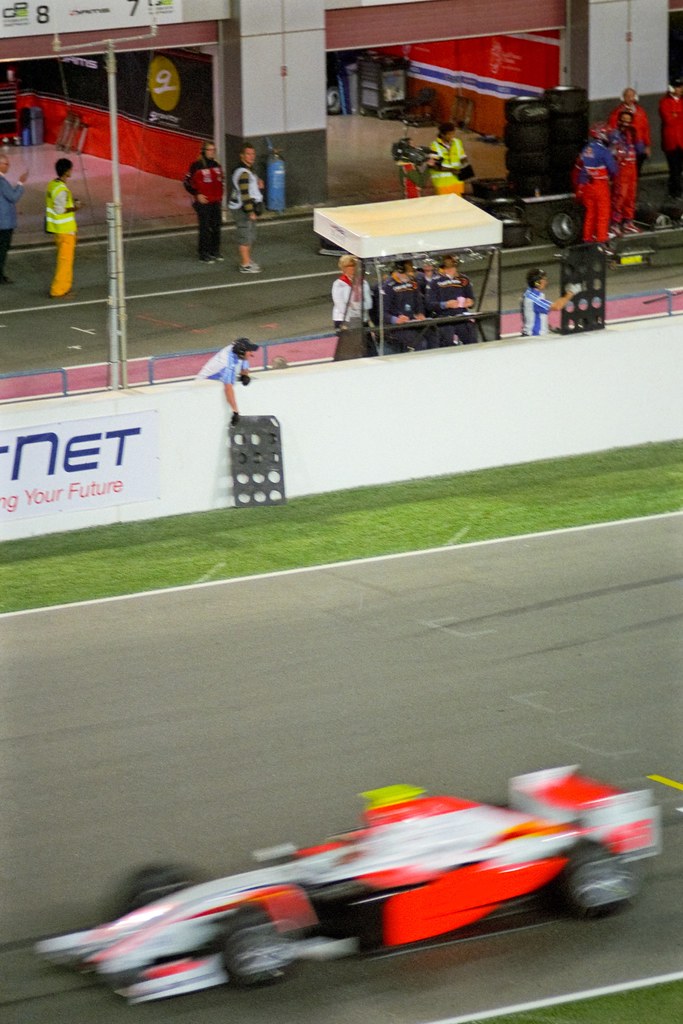
I touched upon this in the previous post. This is perhaps one of the least impressive pictures I have posted so far but it perfectly illustrates the point I'm making. To take a good picture you must start with an idea of what you want to achieve.

I knew I wanted this framing. I wanted the car on the main straight rushing past and the guy holding out the pit board at the top. It meant a vertical framing which gave me very little margin for error. However, knowing what I wanted I persevered and started thinking creatively about how to achieve it.

I could see that catching the car through the viewfinder would be impossible. I relied on my sense of timing. I prefocussed and then backed my head away from the camera whilst keeping it still. In this way I could see the car coming. I knew which bit of the track I had the camera aimed at so it was just a matter of hitting the shutter at the precise instant the car arrived there. Since I could see the car coming this task changed from impossible to possible.

This aspect of previsualisation was essential to the picture and it happened before I touched the shutter. Without it, there would not be this picture.

Contrast and Saturation

Deep Purple

Contrast is one of those things that seem like they should always be a good thing but isn't necessarily. Too much contrast is one of those things that can really suck the realism out of a scene. It also has the paradoxical effect of reducing the appearance of fine texture. Not what you might expect.

Of course when you reduce contrast all of your colours will become weak and pale. You can counter this by increasing the contrast. Don't be afraid of this control. At first you will probably be very reluctant to alter it much but don't be afraid to do whatever adjustment is necessary to match the vision in your head.

If you don't have a picture of what you want to achieve you probably won't accomplish much. But that sounds like another post...

Monday, 16 February 2009

Focus on Shapes and Colours

Splashing

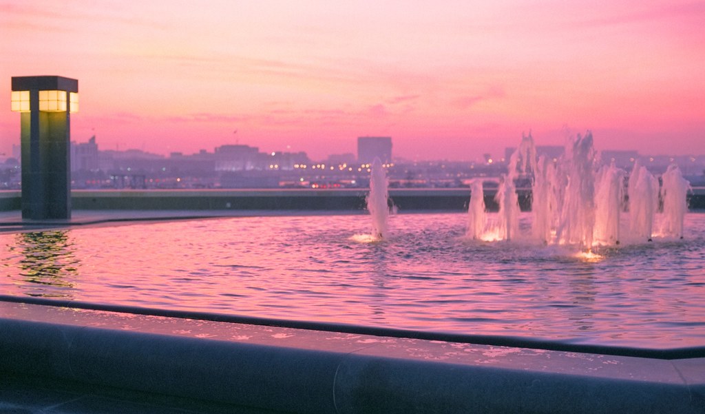
Another thing you will start reading an aweful lot about as you get into photography is sharpness. Sharpness is often talked about as if a picture can't be good without it. In truth, a lot of this probably stems from the difficulty of achieving reasonable sharpness with your average digital SLR and kit lens. Sharpness can be nice, especially if there is something really soft to contrast it to, but sometimes what is important is just the pattern of colours and tones across the frame.

This is a picture including a little water from the fountain outside the Museum of Islamic Arts and a nice sunset sky. There is just enough form in the water to make it recognisable but what makes the picture is the patterns of light across the sky and the balance of light and dark diagonally across the frame. Remember, what you see through the viewfinder is something real but what gets recorded on the film must stand on its own as a complete picture.

Saturday, 14 February 2009

Simplicity and Contrast

MIA with a fifty

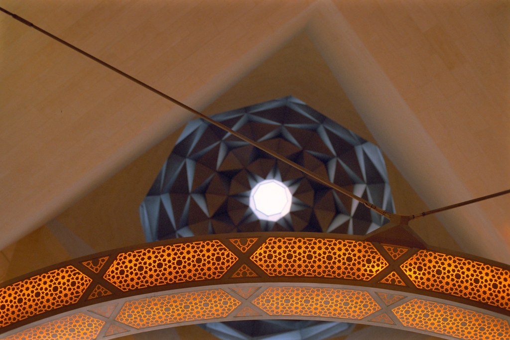
This is one of the successful pictures from my first trip to the Museum of Islamic Arts that opened recently here in Doha. It's not difficult to take a good picture in this building as the architecture is quite stunning. It is simply a matter of finding something interesting and isolating it.

This photo relies on contrasts of sharp and soft, round and straight, warm and cool colours and even intricate detail vs. smooth areas that are almost detail free. The rest of the work in this image just has to do with balancing forms and weights of tone in the frame. This is best judged by eye but as a general rule a shape should be fully present or not. Slivers of half-formed shapes can be distracting.

The best advice generally is think about why something catches your eye and try to isolate it in the frame in an interesting way.

Wednesday, 11 February 2009

Rules Were Made To Be...

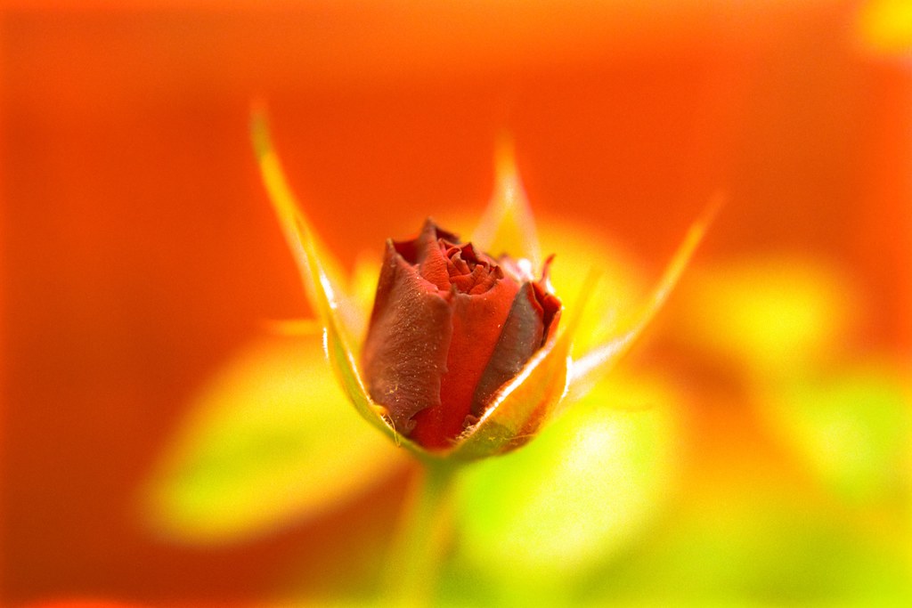
Bud

This is a picture I took recently on a rare day in Doha where there had just been some light rain. We only get a few days of it a year. I took advantage of the refreshed flowers and overcast light and this is one of the keepers from that roll.

If you start taking an interest in photography it will not be long before you start learning about all sorts of "rules". Rules like, never putting the subject in the centre. Rules like putting points of interest on intersections of "thirds". Rules like avoiding large patches of "dead" space in your frame. Some of these rules have merit and it is worth exploring them all but don't let them get in your way.

This picture breaks a lot of these so-called rules. It may not be a great photo in absolute terms but it is definitely one of the best I have shot in a small while. I can confidently make that judgement because I am learning to trust my eye. You should to. Until you can feel the "rightness" of a picture without being able to explain it in terms of rule and formula your work will lack soul.

Sunday, 1 February 2009

What Is Important Here?

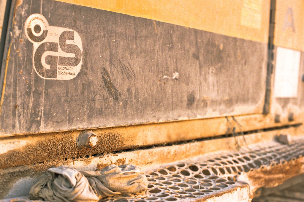
Old Digger XVIII

I think this photo nicely illustrates the idea I want to highlight in this post.

Focus of interest.

There are a number of techniques that can be used to concentrate interest and attention on certain aspects in a picture. Many of them are well known such as compositional techniques like placing items on the intersections of "thirds". Leading lines can be employed and, of course, we are always somewhat drawn to what is in the centre of the frame. Focus, however, can also be a powerful tool for channeling the viewer's attention.

Here the plane of focus has highlighted the rag, the bolt, the writing on the door and the pattern in the footplate. All of these were in focus at once because the plane of focus and the plane of the side of the digger intersect at a diagonal from this viewpoint.

Keep this tool in mind.