Saturday, 30 June 2012

The Ansel Adams Moves

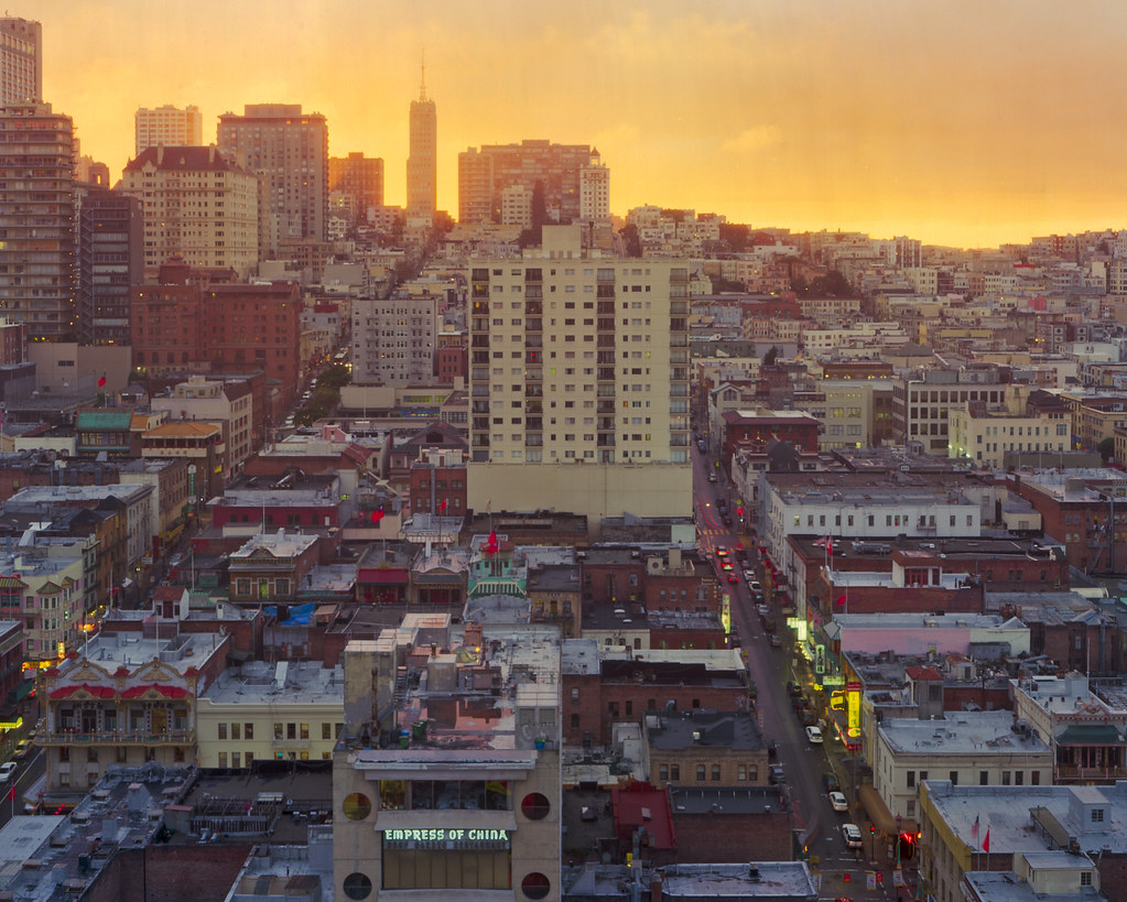
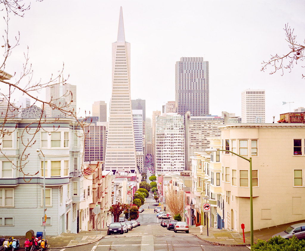
San Francisco Old Transamerica Building

I read a recent article on www.luminous-landscape.com by Alain Briot. He was arguing for greater artistic interpretation in "art" photographs, particularly landscape ones. He described such things as were possible in the darkroom and perfected in the work of Ansel Adams as the "Ansel Adams moves". He went on to cover local geometric distortion, cloning elements and selective colour shifting etcetera as the further alterations that were appropriate now that they are possible.

The gist of his article was that we are all living in the past and should not feel bound by what was done before. After all, what was done before was largely as much as could be done within the scope of the tools available. And, of course, Alain Briot is an artist and does (unlike many luminous-landscape writers) have some attractive and impressive work to back up his words with. Still, it got me thinking if he was right.

I'm not so sure. I feel quite an affinity for the so-called Ansel Adams moves. I feel that art gets power from certain limitations. Is a six string bass always better than a four? Is a synthesizer better than an electric guitar because it can span more notes and make more different sounds? I would say not always, maybe even not often.

Photography is not painting. It defines itself ultimately through the concept of seeing the world through some lens or other. There is a certain implication in a photograph that the picture is related in some fairly simple way to the actual light rays that came in through the lens and formed it. We are happy for a guitar to be distorted, for instance, but not for one of the strings to sound like a piano and the next string like a harp.

The above is a recent picture of mine. It probably has the most "processing" done on it of any photograph I have taken recently. However, they are all "Ansel Adams" moves. It is my hope that the picture still looks natural. As Ansel Adams himself says, once the work that is done on a photograph reaches a level where it is obvious it looses all its power.

Friday, 22 June 2012

Show Me Some Skin

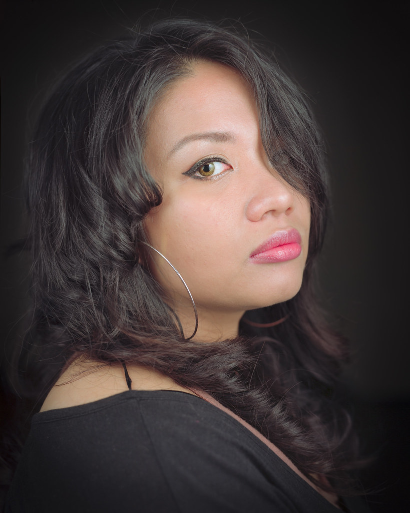
Large Format Sarah K Portrait (On Third Thoughts)

Human skin.

I think it is the most difficult thing to get looking truly natural.

We, as people, are just so highly attuned to what it should look like. We know what colour it should be and we are very highly attuned to any distortion of that colour or any colour casts across the range of tones on the skin. We also know what texture it should be. For us it is a key indicator of health what a person's skin looks like. Sloppy retouching can give a plastic sheen to skin that leaves a person looking ill or even simply unreal.

This is a large format portrait I took a while back of Sarah, who is both beautiful and awesome to work with. I am constrained, currently, by having to work with a rather cheap and cheerful scanner for my large format work. It is difficult, therefore, to get a good scan that preserves all the nuances of tone. As a result I struggled with this particular image for several days. The other versions were not terrible but they were all let down by poor skin tone (colour, texture or both).

I think I've cracked it with this version.

Feel free to disagree in the comments.

Saturday, 26 May 2012

Just Shoot!

Crown Large Format Through-The-Window San Francisco Sunset Chinatown

The scene: Amazing sunset

The problem: Crummy unclean hotel window in the way

The solution: Choose a largish aperture and shield lens with hand

Friday, 4 May 2012

Find The Essence

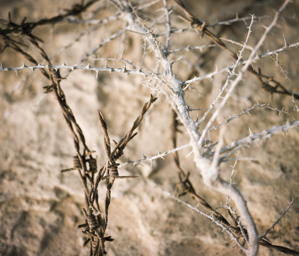
The Crown Of Thorns

I love my large format camera. It makes me think. I went on a trip with a friend to the north of Qatar. He was shooting birds, I was along to share time with a friend and fellow photographer and see a new place. I shot about twenty frames of 35mm film that day and one sheet of 4x5.

It was this.

I found a loop of old barbed wire on a rock. It was entangled and entwined with an equally thorny plant. It immediately put me in mind of the crown of thorns that the Roman soldiers put on Jesus when they mocked him as "king of the jews".

But there was no shot that really got to the depth of the thorniness that included the whole shape that drew me in in the first place. What really summed it up was this.

Wednesday, 18 April 2012

Get Close

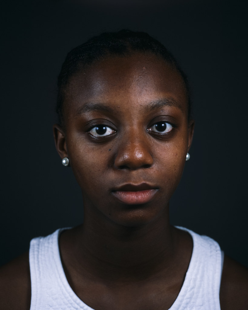
Crown Large Format Faith Portrait

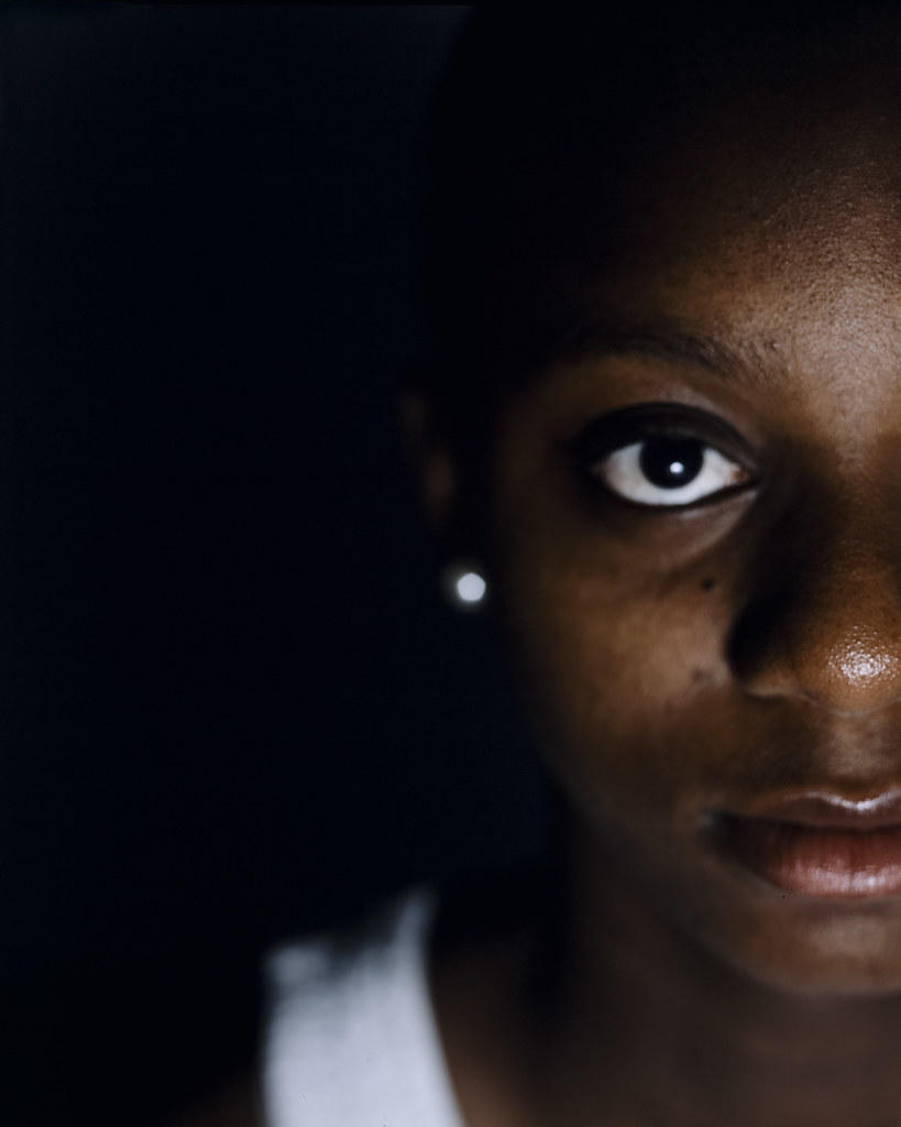
Crown Large Format Faith Portrait II

When I bought my Crown Graphic the first thing I needed was a lens. Naturally, I started with a "normal" length lens. In 4x5 film camera terms this means around 150mm. Of course, one of the things I wanted to do with the camera was portraiture. And I like tight head shots. At first this seemed like an oversight.

I decided to persevere. A view camera doesn't really have any practical limits on how close you can focus the lens. The limits are the length of the rails and the maximum draw of the bellows. But when I tried it I was shocked how close the camera had to be to my subject to achieve focus.

And now I love it. A good picture draws you in. I think these do.

Friday, 13 April 2012

Drum Roll Please

Got some awesome scans done by Tim Parkin in the UK. You can find him at www.cheapdrumscanning.com

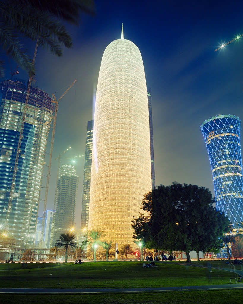
Crown Graphic Interstellar Space Journey Drum Scan

Crown Graphic Space Gherkin Liftoff Drum Scan

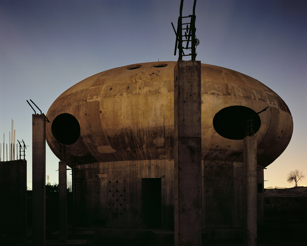
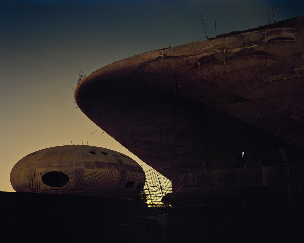
UFO House Doha I Drum Scan

UFO House Doha II Drum Scan

Getting Away in San Francisco Drum Scan